Building My Developer Portfolio with Nuxt 4, SCSS, and Live API Integrations
How I built my personal developer portfolio from scratch using Nuxt 4, Vue 3, SCSS design tokens, the GitHub REST API, and the Blogverse API — with full SSR, unit testing, and Vercel deployment.
Every developer reaches a point where they need a place to call home on the internet — somewhere that reflects who they are, what they build, and how they think about code. After experimenting with various templates and frameworks, I decided to build my own portfolio from the ground up using Nuxt 4, Vue 3, and SCSS. The result is a clean, minimal, dark-themed site that automatically pulls in my latest GitHub repositories and blog articles from the Blogverse API — no manual updates required.
In this article, I walk through every architectural decision, every composable, every design token, and every test that powers nayan-das-portfolio. Whether you are building your own portfolio or simply curious about modern Nuxt development patterns, there is something here for you.
Why I Built It from Scratch
Building your own portfolio is one of the best ways to demonstrate real-world engineering skills to potential employers and collaborators.
I could have used a pre-built theme or a drag-and-drop builder, but that defeats the purpose. A developer portfolio should itself be a project — a living, breathing codebase that showcases your decisions, your taste, and your craft. By building from scratch, I had full control over:
- Performance — Server-side rendering, no unnecessary JavaScript bundles
- Design — A custom dark theme with carefully chosen typography
- Architecture — Clean composable-based data fetching with proper error handling
- Testing — Unit tests for every composable and critical component
- Deployment — Seamless Vercel deployment with SSR compatibility
The Tech Stack
Here is a concise overview of every technology and tool that powers this portfolio:
| Technology | Role | Version |
|---|---|---|
| Nuxt | Full-stack Vue framework with SSR | 4.3+ |
| Vue | Reactive UI components | 3.5+ |
| SCSS (sass-embedded) | Styling with design tokens and mixins | 1.86+ |
| GitHub REST API | Live repository data | v3 |
| Blogverse API | Live blog post data | v1 |
| Vitest | Unit testing framework | 4.0+ |
| @nuxt/test-utils | Nuxt-aware test environment | 4.0+ |
| pnpm | Fast, disk-efficient package manager | 10.29+ |
| Vercel | Hosting and serverless deployment | — |
The project uses Nuxt 4's new app/ directory structure, which cleanly separates application code from configuration files at the root.
Project Structure
The folder layout follows Nuxt 4 conventions with a clear separation of concerns:
nayan-das-portfolio/
├── nuxt.config.ts          # Framework configuration
├── vitest.config.ts         # Test runner configuration
├── package.json             # Dependencies and scripts
└── app/
    ├── app.vue              # Root component
    ├── assets/scss/         # Design tokens, mixins, global styles
    ├── components/          # UI components + icon set
    ├── composables/         # Data-fetching logic
    ├── layouts/             # Page wrappers
    └── pages/               # Route-based pages
Everything inside app/ is the application itself. Everything outside it is configuration. This separation is one of the cleanest patterns Nuxt 4 introduced, and it makes the project remarkably easy to navigate.
Design System: SCSS Tokens and Mixins
Rather than reaching for a CSS framework like Tailwind, I chose to build a bespoke design system with SCSS. This gave me precise control over the visual language while keeping the bundle size minimal.
Design Tokens
All colours, fonts, spacing values, and breakpoints live in a single _variables.scss file:
// Colour palette
$color-bg:         #0a0a0a;   // near-black background
$color-surface:    #141414;   // card / elevated surface
$color-border:     #232323;   // subtle border
$color-text:       #ededed;   // primary text (off-white)
$color-muted:      #888888;   // secondary text
$color-accent:     #3b82f6;   // blue accent

// Typography
$font-heading: 'Space Grotesk', system-ui, sans-serif;
$font-body:    'Inter', system-ui, sans-serif;
$font-mono:    'JetBrains Mono', ui-monospace, monospace;

// Spacing scale (8px base)
$space-1: 0.25rem;   // 4px
$space-2: 0.5rem;    // 8px
$space-3: 0.75rem;   // 12px
$space-4: 1rem;      // 16px
$space-5: 1.5rem;    // 24px
$space-6: 2rem;      // 32px
$space-7: 3rem;      // 48px
$space-8: 4rem;      // 64px
These tokens are automatically injected into every Vue component's <style lang="scss"> block through Nuxt's Vite SCSS additionalData configuration — no manual imports needed.
Reusable Mixins
Alongside the tokens, a _mixins.scss file provides reusable patterns:
// Responsive breakpoints
@mixin sm { @media (min-width: 640px)  { @content; } }
@mixin md { @media (min-width: 768px)  { @content; } }
@mixin lg { @media (min-width: 1024px) { @content; } }

// Truncate text to N lines
@mixin line-clamp($lines: 2) {
  display: -webkit-box;
  -webkit-line-clamp: $lines;
  -webkit-box-orient: vertical;
  overflow: hidden;
}

// Smooth transitions
@mixin transition($props: all, $dur: 0.2s) {
  transition: $props $dur cubic-bezier(0.4, 0, 0.2, 1);
}

// Card surface style
@mixin card {
  background: $color-surface;
  border: 1px solid $color-border;
  border-radius: $border-radius;
}
The _shared.scss partial uses @forward to expose both variables and mixins as a single entry point:
@forward 'variables';
@forward 'mixins';
And in nuxt.config.ts, the magic happens:
vite: {
  css: {
    preprocessorOptions: {
      scss: {
        api: 'modern-compiler' as const,
        loadPaths: [scssDir],
        additionalData: `@use 'sass:color'; @use 'shared' as *;`,
      } as Record<string, unknown>,
    },
  },
},
Using api: 'modern-compiler' with sass-embedded eliminates legacy JS API deprecation warnings and provides significantly faster compilation.
This means every single component automatically has access to all design tokens and mixins without writing a single @use statement. Clean, efficient, and zero duplication.
The Component Architecture
The portfolio is composed of five primary components, each with a single, well-defined responsibility.
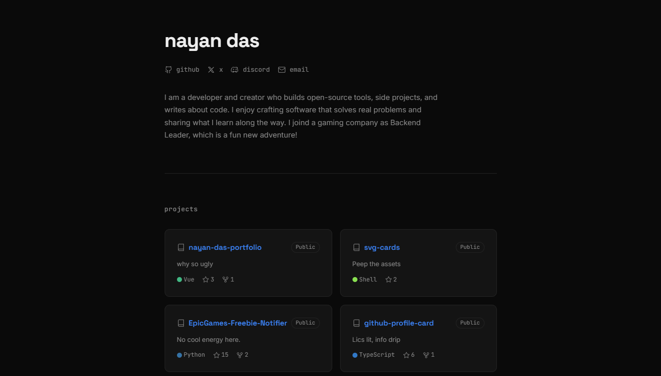
AppHeader
The header displays my name, social navigation links (GitHub, X, Discord, Email), and a short bio. Each social link uses a custom SVG icon component with thin, iOS SF-style strokes:
<template>
  <header class="header fade-up">
    <h1 class="header__name">nayan das</h1>
    <nav class="header__nav" aria-label="Social links">
      <a
        v-for="link in socials"
        :key="link.label"
        :href="link.url"
        :aria-label="link.label"
        class="header__link"
        target="_blank"
        rel="noopener noreferrer"
      >
        <component :is="link.icon" />
        <span>{{ link.label }}</span>
      </a>
    </nav>
    <p class="header__bio">
      I am a developer and creator who builds open-source tools...
    </p>
  </header>
</template>
Every external link uses target="_blank" with rel="noopener noreferrer" for security, and each link carries an aria-label for screen reader accessibility.
ProjectsSection and ProjectCard
The projects section fetches my six most recently pushed public repositories from the GitHub API and renders them in a responsive two-column grid. Each card shows:
- Repository name with a repo icon
- A "Public" badge
- The description (clamped to two lines)
- The primary language with its official GitHub colour dot
- Star and fork counts
The language colours come from the useLanguageList composable, which contains a comprehensive map of over 500 programming languages to their official GitHub hex colours — sourced directly from GitHub's Linguist library.
ArticlesSection
This component fetches my most recent blog posts from the Blogverse API and renders them as a clean, scannable list. Each article entry displays:
- Title with a hover-reveal external arrow
- Description (clamped to two lines)
- Publication date formatted as "Jan 30, 2026"
- Estimated reading time with a clock icon
- Up to four tags as styled chips
AppFooter
A minimal footer showing the copyright year (dynamically calculated) and a link back to the source code on GitHub.
Data Fetching: Composables in Depth
The data layer is arguably the most interesting part of this portfolio. Rather than hardcoding project data or manually maintaining a list, everything is fetched live from external APIs.
useGithubRepos
This composable leverages Nuxt's useAsyncData with $fetch to hit the GitHub REST API:
export function useGithubRepos(username = 'nayandas69', limit = 6) {
  const apiUrl = `https://api.github.com/users/${username}/repos`;

  const { data: repos, status, error } = useAsyncData(
    `github-repos-${username}`,
    () => $fetch(apiUrl, {
      params: { sort: 'pushed', per_page: limit, type: 'public' },
      headers: { Accept: 'application/vnd.github+json' },
    }),
    {
      transform: (raw) => {
        if (!Array.isArray(raw)) return [];
        return raw.map((repo) => ({
          name: repo.name,
          description: repo.description || 'No description provided.',
          language: repo.language,
          stars: repo.stargazers_count,
          forks: repo.forks_count,
          url: repo.html_url,
          homepage: repo.homepage,
          pushedAt: repo.pushed_at,
          topics: repo.topics || [],
        }));
      },
      default: () => [],
    }
  );

  const loading = computed(() => status.value === 'pending');
  return { repos, loading, error };
}
The transform function reshapes the raw GitHub response into a clean, minimal object. This ensures the template layer never has to deal with the verbose GitHub API schema.
Key design decisions here:
useAsyncDataoveruseFetch— Gives more control over the fetch function and allows custom$fetchconfiguration- Transform at the composable level — Components receive only the data they need
- Defensive defaults — A fallback empty array prevents null reference errors
- Computed loading state — Derived from Nuxt's built-in
statusref for reliability
useBlogPosts
The blog posts composable connects to the Blogverse API, a custom MDX-powered blog platform I built separately:
export function useBlogPosts(limit = 5) {
  const API_BASE = 'https://blogverse-five-omega.vercel.app/api/v1';
  const url = `${API_BASE}/posts/recent?limit=${limit}`;

  const { data: posts, status, error } = useFetch(url, {
    key: `blog-posts-recent-${limit}`,
    transform: (raw) => {
      if (!raw?.success || !raw?.data) return [];
      return raw.data.map((post) => ({
        slug: post.slug,
        title: post.frontmatter?.title || 'Untitled',
        description: post.frontmatter?.description || post.excerpt || '',
        date: post.frontmatter?.date || '',
        tags: post.frontmatter?.tags || [],
        readingTime: post.readingTime || 0,
        url: `https://blogverse-five-omega.vercel.app/blog/${post.slug}`,
      }));
    },
  });

  const loading = computed(() => status.value === 'pending');
  return { posts, loading, error };
}
The Blogverse API is public with CORS enabled and requires no authentication. It supports pagination, tag-based filtering, reading time calculation, and stale-while-revalidate caching out of the box. You can explore it yourself at blogverse-five-omega.vercel.app/api/v1.
This composable uses useFetch instead of useAsyncData because the endpoint is a simple URL with no custom fetch logic needed. Both composables follow the same pattern: fetch, transform, expose reactive refs.
The Blogverse Connection
My portfolio does not exist in isolation. It is tightly integrated with Blogverse — a separate open-source project I built as a modern, MDX-powered blog platform. Here is how the two systems connect:
- I write
.mdxfiles in the Blogverse repository with frontmatter metadata - Blogverse processes them and exposes the content through a RESTful API
- My portfolio fetches the latest posts via
useBlogPostsand renders them - Clicking an article takes you directly to the full post on Blogverse
This decoupled architecture means I can publish a new blog post by simply pushing an .mdx file to the Blogverse repo — and my portfolio automatically reflects the change. No rebuilds, no redeployments of the portfolio itself.
The Blogverse API
The API offers several endpoints:
| Endpoint | Method | Description |
|---|---|---|
/posts | GET | All posts with pagination |
/posts/recent | GET | Most recent posts |
/posts/:slug | GET | Single post by slug |
/posts/tag/:tag | GET | Posts filtered by tag |
/tags | GET | All available tags |
/stats | GET | Blog statistics |
You can test all these endpoints live at blogverse-five-omega.vercel.app/api-test — a built-in interactive API test console.
Testing Strategy
I firmly believe that even a personal portfolio deserves proper tests. This project uses Vitest with @nuxt/test-utils to create a Nuxt-aware testing environment that supports auto-imports, composables, and component mounting.
Component Tests
The AppHeader test suite validates rendering, accessibility, and link correctness:
import { mountSuspended } from '@nuxt/test-utils/runtime';
import AppHeader from '~/components/AppHeader.vue';

describe('AppHeader', () => {
  it('renders "nayan das" as the heading', async () => {
    const wrapper = await mountSuspended(AppHeader);
    const heading = wrapper.find('h1');
    expect(heading.text()).toBe('nayan das');
  });

  it('renders exactly 4 social links', async () => {
    const wrapper = await mountSuspended(AppHeader);
    const links = wrapper.findAll('nav a');
    expect(links.length).toBe(4);
  });

  it('each social link has an aria-label for accessibility', async () => {
    const wrapper = await mountSuspended(AppHeader);
    wrapper.findAll('nav a').forEach((link) => {
      expect(link.attributes('aria-label')).toBeTruthy();
    });
  });
});
Composable Tests
The composable tests use registerEndpoint from @nuxt/test-utils/runtime to mock API responses without hitting real endpoints:
import { registerEndpoint } from '@nuxt/test-utils/runtime';
import { useGithubRepos } from '~/composables/useGithubRepos';

it('transforms raw API response into clean shape', async () => {
  registerEndpoint(
    'https://api.github.com/users/testuser/repos',
    () => mockRepos
  );

  const { repos } = useGithubRepos('testuser', 2);
  await new Promise((resolve) => setTimeout(resolve, 100));

  expect(repos.value[0]).toMatchObject({
    name: 'cool-project',
    stars: 42,
    language: 'JavaScript',
  });
});
When testing composables that use useAsyncData or useFetch, remember that data resolution is asynchronous. You need to wait for the async operation to complete before asserting on the results.
The test configuration in vitest.config.ts uses the Nuxt environment so that all framework features — auto-imports, composables, $fetch — work identically to the real application:
import { defineVitestConfig } from '@nuxt/test-utils/config';

export default defineVitestConfig({
  test: {
    environment: 'nuxt',
    include: ['__tests__/**/*.test.{js,ts}'],
    testTimeout: 15000,
  },
});
SEO and Accessibility
SEO Configuration
The nuxt.config.js includes comprehensive meta tags for search engines and social sharing:
- Open Graph tags for rich link previews on social platforms
- Twitter card metadata for X (formerly Twitter) previews
- A descriptive
<title>and<meta description>for search engine indexing - Proper
lang="en"on the HTML element - A custom theme-color (
#0a0a0a) matching the dark background
Accessibility Features
- Semantic HTML throughout (
<header>,<nav>,<main>,<footer>,<section>) aria-labelattributes on all navigation elements and interactive linksaria-labelledbyon sections pointing to their heading IDs- Focus-visible ring styles for keyboard navigation
- Screen-reader-only text via a
.sr-onlyutility class - Sufficient colour contrast between text and background
Accessibility is not optional. Even a personal portfolio should be navigable by keyboard and understandable by screen readers. These are fundamental requirements, not nice-to-have features.
Global Styles and Animations
The global stylesheet (main.scss) establishes the visual foundation:
- CSS Reset — A minimal reset that removes default margins, padding, and sets
box-sizing: border-box - Typography Scale — Headings use Space Grotesk; body text uses Inter; code uses JetBrains Mono
- Link Styles — Subtle colour transitions with an accent colour on hover and a focus ring for keyboard users
- Skeleton Loaders — A shimmer animation using
background-sizeanimation for loading states - Fade-Up Animation — Components enter the viewport with a smooth upward fade using
translateY
@keyframes fadeUp {
  from { opacity: 0; transform: translateY(12px); }
  to   { opacity: 1; transform: translateY(0); }
}

.fade-up {
  animation: fadeUp 0.5s ease forwards;
}
The skeleton loader creates a polished loading experience instead of showing blank space while APIs respond:
.skeleton {
  background: linear-gradient(
    90deg,
    $color-surface 25%,
    color.adjust($color-surface, $lightness: 4%) 50%,
    $color-surface 75%
  );
  background-size: 200% 100%;
  animation: shimmer 1.5s ease-in-out infinite;
}
Deployment on Vercel
The portfolio is deployed on Vercel with SSR enabled. The configuration is straightforward:
// nuxt.config.js
ssr: true,
compatibilityDate: '2025-01-01',
Nuxt automatically detects the Vercel environment and configures serverless functions for SSR. The result:
- Fast initial loads — HTML is server-rendered with all data pre-fetched
- Automatic HTTPS — Vercel handles SSL certificates
- Edge caching — Static assets are cached at the edge globally
- Zero-config deploys — Push to
mainand the site updates
The entire portfolio — including SSR, API calls, and all static assets — deploys in under 30 seconds on Vercel with zero configuration beyond ssr: true.
Lessons Learned
Building this portfolio reinforced several principles that I carry into every project:
- Composables are powerful abstractions — By encapsulating data fetching into
useGithubReposanduseBlogPosts, the components stay clean and focused on presentation - Design tokens prevent chaos — Having a single source of truth for colours, spacing, and typography makes consistency effortless
- SCSS module system matters — Using
@useand@forwardinstead of the deprecated@importeliminates duplicate loading and keeps the dependency graph clean - Test your data layer — Even in a portfolio, mocking API endpoints and testing transforms catches bugs before they reach production
- Automate everything — Live API integrations mean I never have to manually update my project list or article feed
Fork It, Build Yours
This portfolio is fully open-source under the MIT License. You can:
- View the source: nayan-das-portfolio
- Fork it and customise it for yourself
- Open issues or submit pull requests
- Use it as a reference for Nuxt 4 best practices
If you want a blog to go with it, check out Blogverse — the MDX-powered blog platform that feeds articles directly into this portfolio via its public API.
More Posts

Git and GitHub: From Confusion to M...
Master Git and GitHub from first principles. Learn version control, collaboration workflows, and real-world practices that professional developers actually use every day.
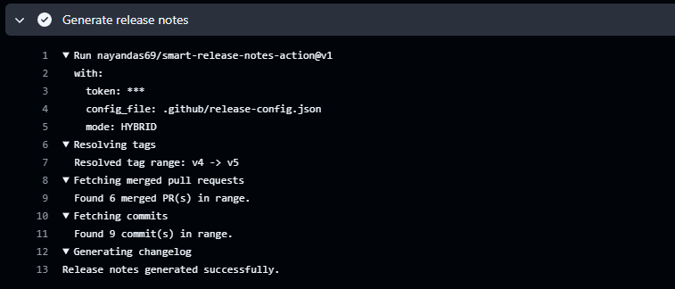
Automating Release Notes Like a Pro...
Discover how to automatically generate clean, categorized release notes directly from your GitHub PRs and commits using Smart Release Notes Action. Learn setup, configuration, and best practices for seamless release automation.

Building a Dynamic GitHub Profile C...
Learn how to build a real-time GitHub profile card generator using Node.js, GraphQL, and SVG rendering. Explore caching strategies, API optimization, and deployment techniques.